
Fix Qwen Image text: spelling and unwanted words
Fix Qwen Image text with a focused edit or a clean artwork workflow. Inspect real before-and-after results and know when to stop retrying.
Last updated: 2026-10-15
Keep the good layout. Fix the smallest problem.
If the composition already works, do not start with a longer prompt. Decide whether the problem is one incorrect word, too many text blocks, or a paragraph that needs precise typography. A single heading is worth trying to repair in Edit mode. Fine print and exact brand lettering are usually better added in a design editor.
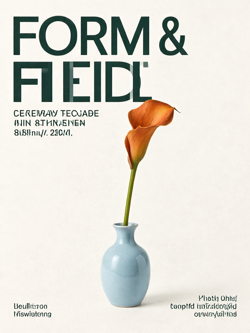
Our tested poster example produced a readable main heading but garbled decorative small text. That is why a sharp-looking preview is not a spelling check. The test below shows both an unsuccessful repair and a simpler alternative. Other prompt examples are starting points, not benchmarked recipes.
Our test: simplify the task when a repair fails
On October 15, 2026, we used the Qwen Image 3 poster below as the reference. Its intended heading was “FORM & FIELD”, but the letters overlap and the small captions are gibberish. We made two separate edits from that same original; the second did not use the first edit as input.
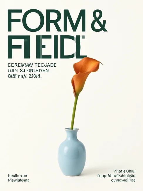
First, we asked Qwen Image 3 Pro to correct the heading and remove the small captions. That result still contains the unwanted lettering. The vase texture also changed. A completed generation is not the same as a successful repair.
For the second attempt, we chose Qwen Image 2.1 and removed the text requirement entirely:
Remove ALL text and letters from this poster. Leave only the orange flower in the pale blue vase on plain off-white paper. Keep the flower and vase in place. The entire background must be blank, with no writing anywhere.
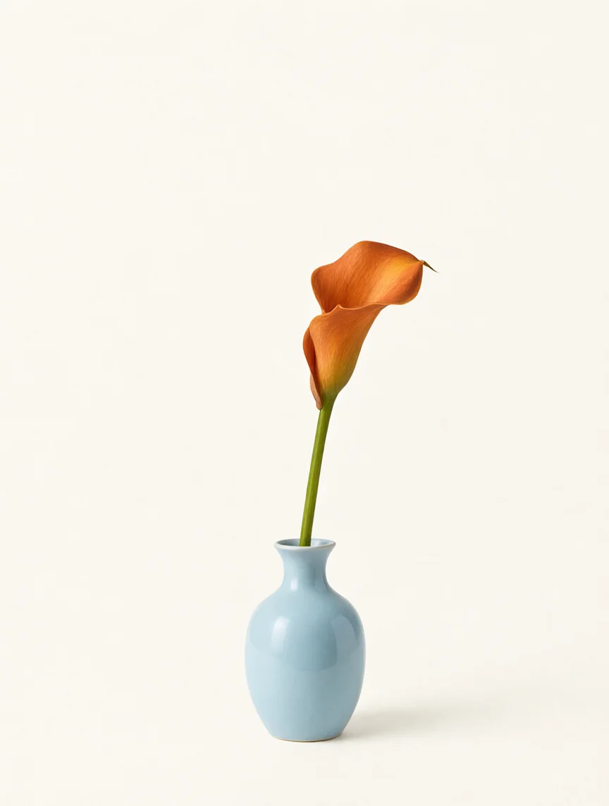
The second result has a blank background suitable for adding editable type in a design editor. The flower and vase remain recognizable, but their shape and position are not pixel-identical. Use this approach when correct typography matters more than preserving every detail of the generated artwork.
Both edits used 1K, a 3:4 ratio, PNG, seed 42 and prompt enhancement off. The first used “watermark” as its negative prompt; 2.1 has no negative-prompt control. This is one example of each instruction, not a model ranking or a success-rate estimate. The source and full-size outputs are available above; previews are compressed for page loading.
First, identify which failure you have
- One wrong word: upload the best output in Edit mode and request only that replacement.
- Extra captions: remove secondary copy from your brief. Say exactly which words may appear.
- Tiny or crowded letters: use a shorter heading, more empty space and fewer text areas.
- Correct words, wrong font or spacing: finish the typography in a design editor where letters remain editable.
Download the original and inspect it at 100%. Check dates, prices, punctuation and letter order individually. A thumbnail can hide errors that will be obvious in an advertisement.
A simpler prompt for the next draft
Start with one heading and one visual subject. Put the exact visible wording in quotation marks, separate it from the scene description, and describe its position. Qwen's official 2.1 editing prompt guidance also distinguishes visible text from descriptive instructions.
Create a vertical concert poster with one silver ribbon on a midnight blue background. The only visible text is "LUMEN" in large letters at the top and "AFTER DARK" below it. Leave generous clear space around both lines. No other captions, dates, logos or small print.
Select the portrait aspect ratio in the workspace, rather than relying on the word “vertical” alone. Use 1K for the initial layout. A 2K output gives you more pixels; it does not guarantee correct spelling.
Repair one word in Edit mode
- Save the best original, then select Edit and upload it as your single reference.
- Keep an aspect ratio close to the original so the task does not also require a new composition.
- Identify the location and exact replacement. State what must stay unchanged.
- Generate once, then compare the heading, background and subject with the original.
In the large heading at the top, replace the incorrect event name with exactly "LUMEN". Keep the silver ribbon, blue background, lower "AFTER DARK" line, framing and layout unchanged. Do not add any new text.
This workspace has no brush mask. The preservation instruction is a request to the model, not a locked region. If the edit fixes the spelling but changes the artwork, keep the earlier artwork and place the corrected heading over it in a design editor.
When to stop spending credits
Set a small attempt budget before you begin. For example, with Qwen Image 2.1, one draft plus one repair at 1K uses 70 credits. Reassess after the repair instead of assuming repeated identical requests will converge. See resolution and costs.
For a menu, legal line, exact logo or many prices, generate the illustration with an empty text area and add the final words separately. This gives you editable spelling, line breaks and font sizes. It is also easier to update next month's date without regenerating the art.
Does English work better than Chinese?
Do not translate the words you actually want printed just to change the prompt language. Specify the desired text explicitly in its intended language. For a bilingual layout, name each line and its position. Review every line yourself; a fluent-looking image is not proof of correct characters.